How Does Choosing the Right Color Scheme Impact an ADU’s Design and Value?
49 min read
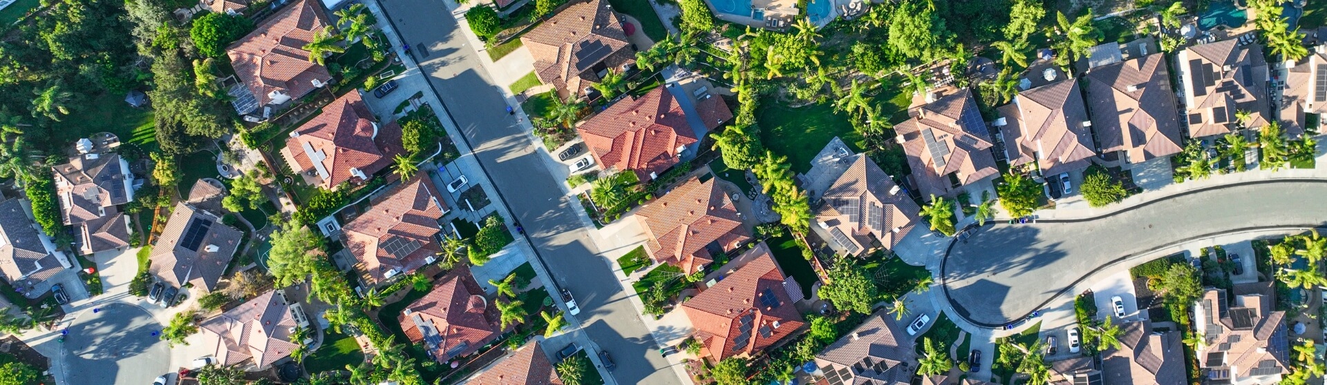
Choosing the right color scheme for an ADU is one of the most impactful design decisions homeowners can make, because color directly influences how spacious, cohesive, and livable a small home feels. This is especially important in California, where ADU permits increased by more than 15,000% between 2016 and 2023, with over 83,000 units approved statewide (CA YIMBY). Light, neutral colors and consistent palettes help reflect natural light, improve visual flow, and prevent compact spaces from feeling confined, while structured approaches like the 60-30-10 color rule add balance without overwhelm. Well-chosen color schemes also support rental appeal and long-term value, particularly as ADUs accounted for about 20% of all new home construction in California in 2023 (Yahoo Finance).

What Is an ADU and Why Color Matters
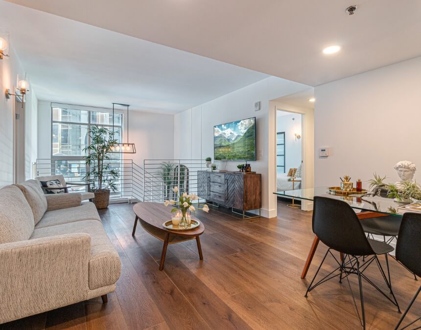
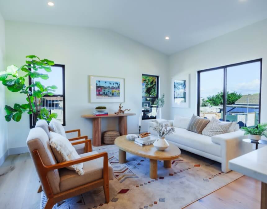
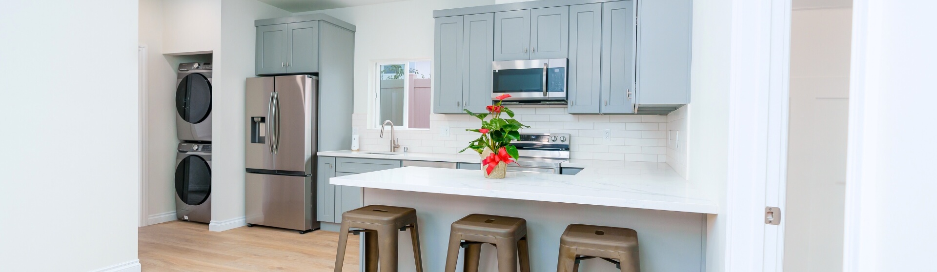
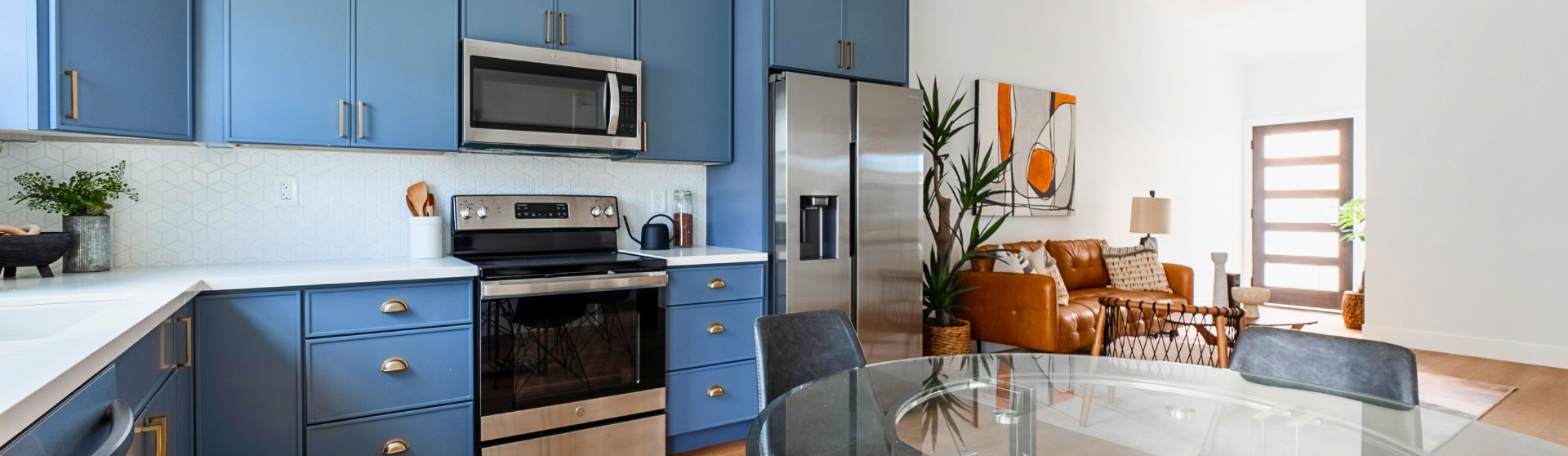
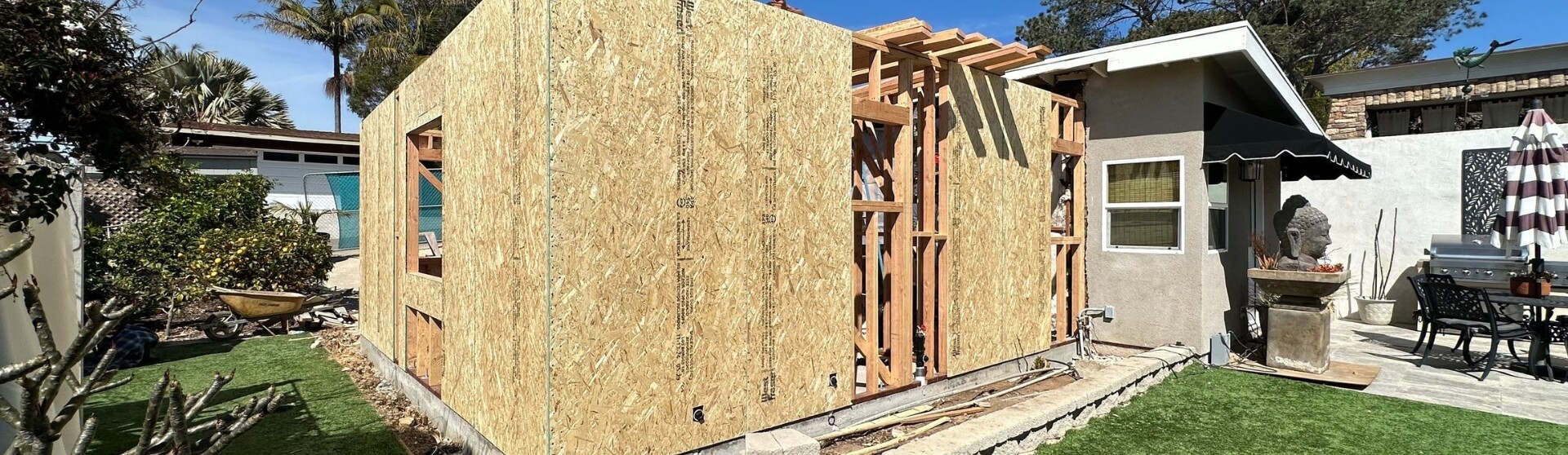
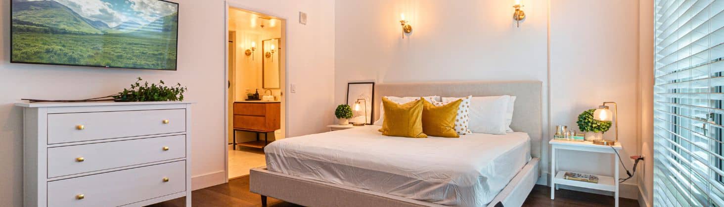
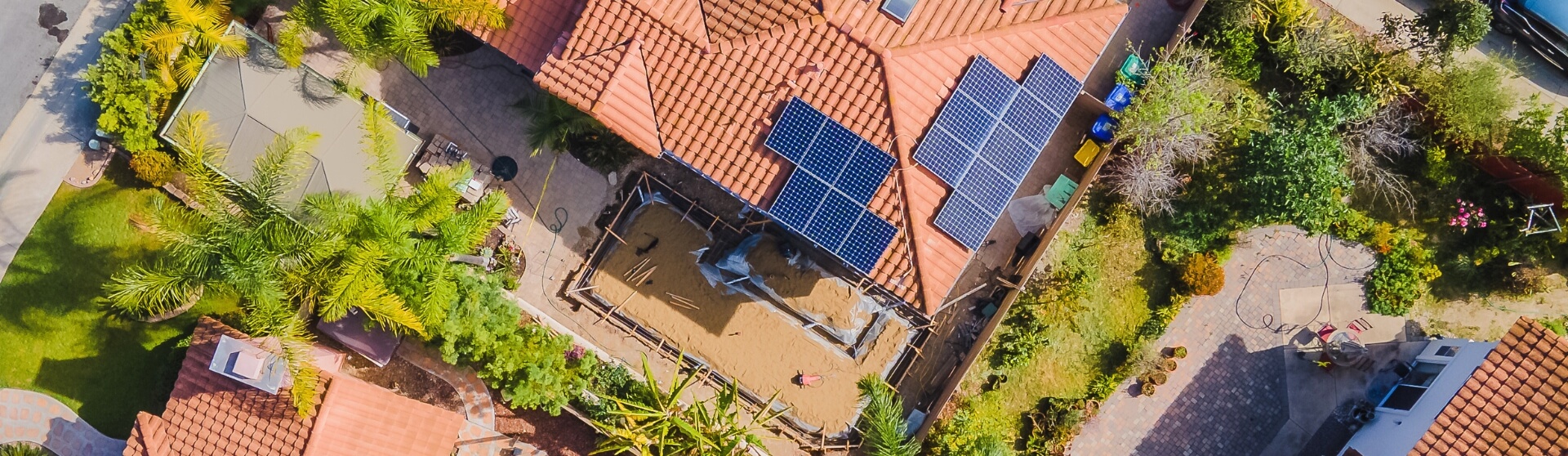
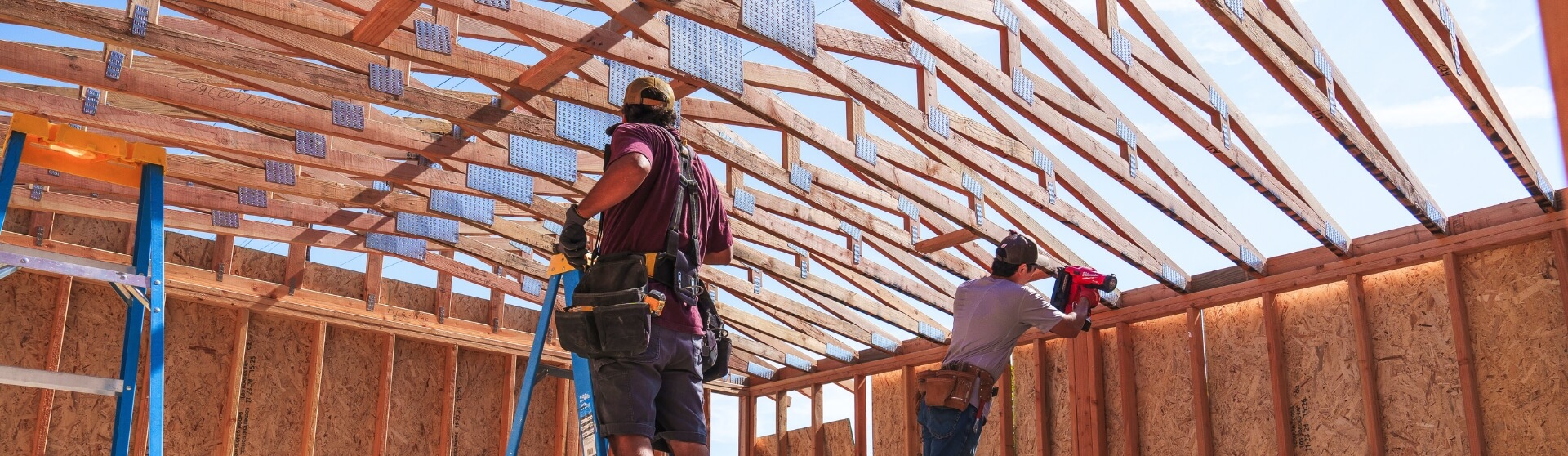
An Accessory Dwelling Unit (ADU) is a small, self-contained residential home built on the same lot as a primary residence, commonly used as rental properties, guest houses, or in-law suites. Because ADUs often have a compact floor plan—including garage conversions and custom small homes—color choices play an outsized role in how large, comfortable, and functional the space feels. Interior design experts consistently note that light, neutral colors reflect natural lighting and visually expand small interiors, helping open-concept living areas feel more breathable while supporting layout planning and smart furniture placement.
Neutral palettes also provide a flexible foundation, allowing homeowners to personalize spaces with layered lighting, multi-functional furniture, and built-in cabinetry without overwhelming the layout or reducing property value. As a result, popular ADU interior design styles—such as Scandinavian, Bohemian, and Industrial – rely on intentional color restraint and cohesive palettes to enhance livability while remaining attractive for rental income. Subtle accents like soft gray and navy add character and depth without limiting appeal for renters or guests, making them well suited for ADUs designed as in-law apartments or long-term rental units in markets like Los Angeles and Sonoma County.
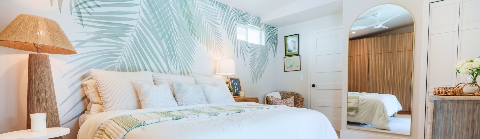
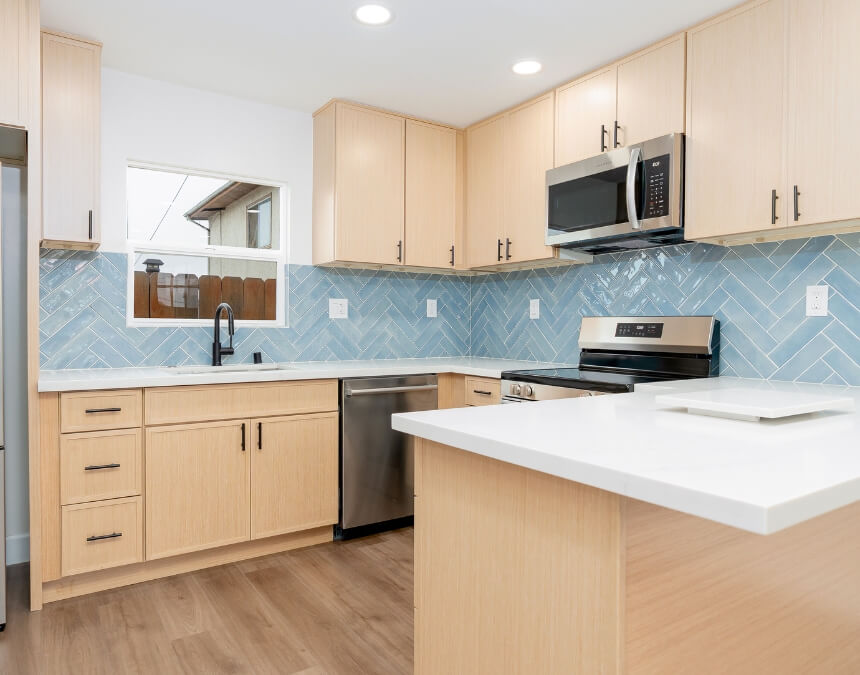
In compact ADUs, a consistent, light color palette helps unify open-plan layouts and makes the space feel larger—an essential strategy for maximizing livability and long-term rental appeal.
Beyond Aesthetics: How Color Impacts Functionality and Feel in Small Spaces
In small living environments like ADUs, color directly affects how the space functions—not just how it looks—especially in layouts designed around an open floor plan or compact footprints dictated by California’s ADU laws. Light, cool colors such as whites, soft grays, and pale neutrals visually recede, helping walls feel farther apart and making compact rooms with features like vaulted ceilings or glass walls feel larger and less confined. Using a consistent color palette throughout the ADU improves visual flow, which is particularly important when integrating wall shelving units, vertical spaces, or multi-use zones that could otherwise feel visually cluttered.
Designers also recommend limiting palettes to a dominant color, a secondary color, and restrained accents to avoid sensory overload in tight spaces—a principle reinforced by the widely used 60-30-10 rule (The Spruce). When paired with reflective finishes, French doors, and natural light sources such as skylights or large windows—often encouraged by Title 24 energy standards—lighter hues amplify available light, enhancing everyday comfort while increasing the perceived square footage of the ADU.
The Goal: Creating Harmony, Maximizing Space, and Reflecting Style
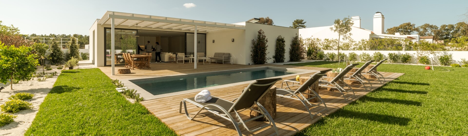
The goal of an ADU color scheme is to create harmony, make the space feel larger, and clearly reflect a chosen design style—while still aligning with practical considerations such as California’s ADU laws and building codes that influence layout and exterior design. Modern and minimalist ADUs often use light, neutral palettes to emphasize clean lines and openness, a strategy that pairs well with modern ADU exteriors, simple roof styles, and energy-efficient appliances. In contrast, Mediterranean, Spanish, or farmhouse aesthetic ADUs rely on warmer hues and textured finishes—such as stucco or shiplap walls—to create a timeless, character-driven look that complements both interior and outdoor space.
Across styles, designers rely on structured approaches like monochromatic, complementary, or analogous color schemes to keep compact layouts cohesive, regardless of lot size or floor plan constraints. One of the most widely used frameworks is the 60-30-10 rule, which recommends allocating 60% of a room to a dominant color, 30% to a secondary color, and 10% to an accent to maintain balance and avoid visual overload (The Spruce).
Design styles such as Scandinavian, Bohemian, and Industrial depend heavily on this type of intentional color planning—especially when incorporating elements like wall shelves, vertical gardens, or smart features—to maintain harmony and prevent compact ADUs from feeling cluttered or chaotic.
Harmonized color schemes paired with warm wood tones create visual continuity, allowing small ADUs to feel intentional, calm, and well-proportioned rather than segmented or crowded.
Foundational Color Principles for ADUs
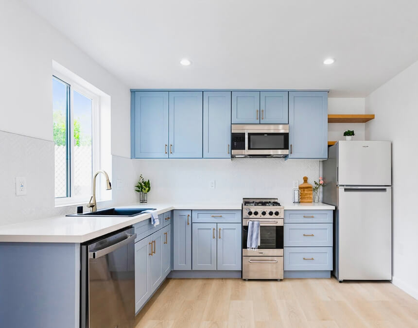
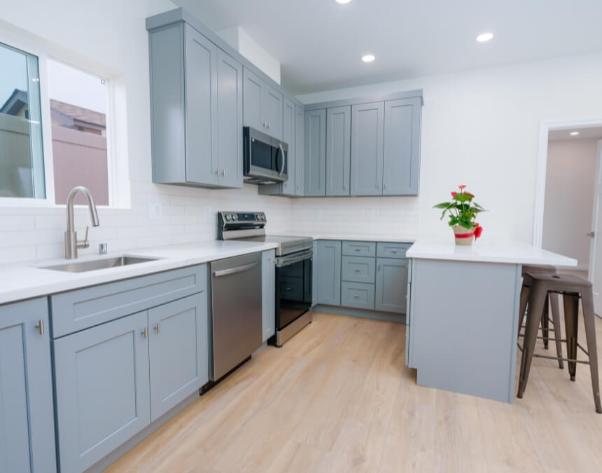
Successful ADU color schemes are built on a few core principles that balance comfort, openness, and versatility in small spaces, while also supporting modern expectations around smart technology and green features. Warm colors like red, orange, and yellow tend to create intimacy and coziness, but designers caution they should be used sparingly in ADUs because they can visually close in compact rooms—especially in prefabricated ADUs or shipping container homes with limited square footage. In contrast, cool colors such as blue, green, and gray promote calm and visual openness, helping small interiors feel lighter and more spacious regardless of siding styles or layout constraints.
Neutral palettes—especially whites, light grays, and soft beiges—reflect natural light and remain the most renter-friendly option, providing flexibility for different furnishings, wall beds, or storage ottomans. Within that neutral foundation, soft gray and navy blue have emerged as popular accent or secondary tones, offering depth and character without overwhelming the space or increasing costs. Finally, maintaining color consistency across rooms strengthens visual cohesion and helps the ADU feel larger and more unified overall, an approach that aligns well with cost-saving strategies and long-term value in compliance with California’s ADU laws.
Pairing warm materials with light, neutral foundations creates balance—maintaining brightness while preventing small ADUs from feeling cold or sterile.
Understanding Color Theory Basics for ADU Homeowners
Understanding basic color theory helps homeowners make confident interior design decisions in small spaces like ADUs, especially when layouts are shaped by California’s ADU laws and strict building code requirements. Primary, secondary, and tertiary colors form the foundation of harmonious palettes, guiding how colors relate to and complement one another within a room—whether the ADU features a coastal design style, modern finishes, or a more traditional layout. Warm undertones such as red, orange, or yellow tend to make spaces feel cozier, while cool undertones like blue, green, and gray visually recede, helping compact interiors feel more open and spacious.
From a practical standpoint, neutral interiors appeal to a broader pool of renters by offering flexibility and avoiding overly personal design choices. To prevent visual clutter while still adding character, designers often recommend introducing depth through restrained tones like soft gray or navy, layered within an otherwise light, neutral palette that helps ADUs feel larger and more breathable—an approach commonly explored during 3D design consultations or virtual model planning.
Blending warm and cool tones strategically helps control how a small ADU feels—cool hues visually expand space, while warm accents add comfort without closing it in.
Color Psychology in Smaller Living Areas
Color psychology plays a critical role in how small ADU interiors are perceived and experienced, particularly in homes designed under California’s ADU laws and strict building code requirements. Warm tones such as reds, oranges, and yellows can create a sense of comfort and intimacy, but when overused in compact layouts they may visually close in the room—especially in ADUs with limited square footage or low ceilings. In contrast, cool tones like blues, greens, and soft grays tend to recede visually, helping small living areas feel calmer, lighter, and more expansive regardless of exterior materials like clapboard lap siding or metal roofs.
Designers consistently recommend whites, light grays, and soft pastels because they reflect natural light and reduce visual weight, making ADUs feel brighter and more breathable while complementing energy-conscious features such as solar panels or smart thermostats. To avoid visual noise, balanced color schemes—such as monochromatic or analogous palettes—work best in small spaces, with accent colors used sparingly so they enhance the interior without overwhelming the overall design.
Light, warm neutrals support emotional comfort and perceived openness, making compact living environments feel calmer and more inviting.
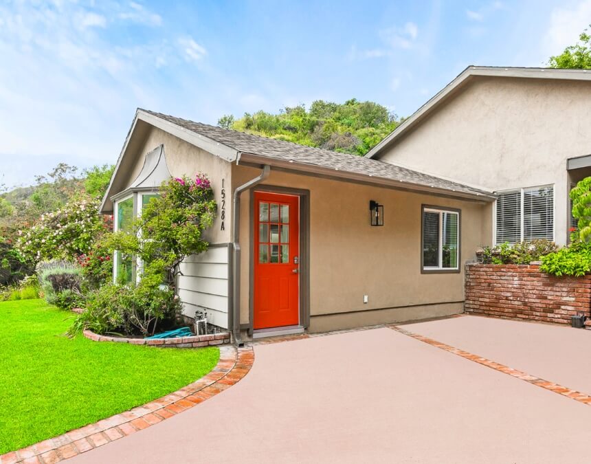
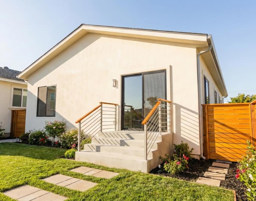
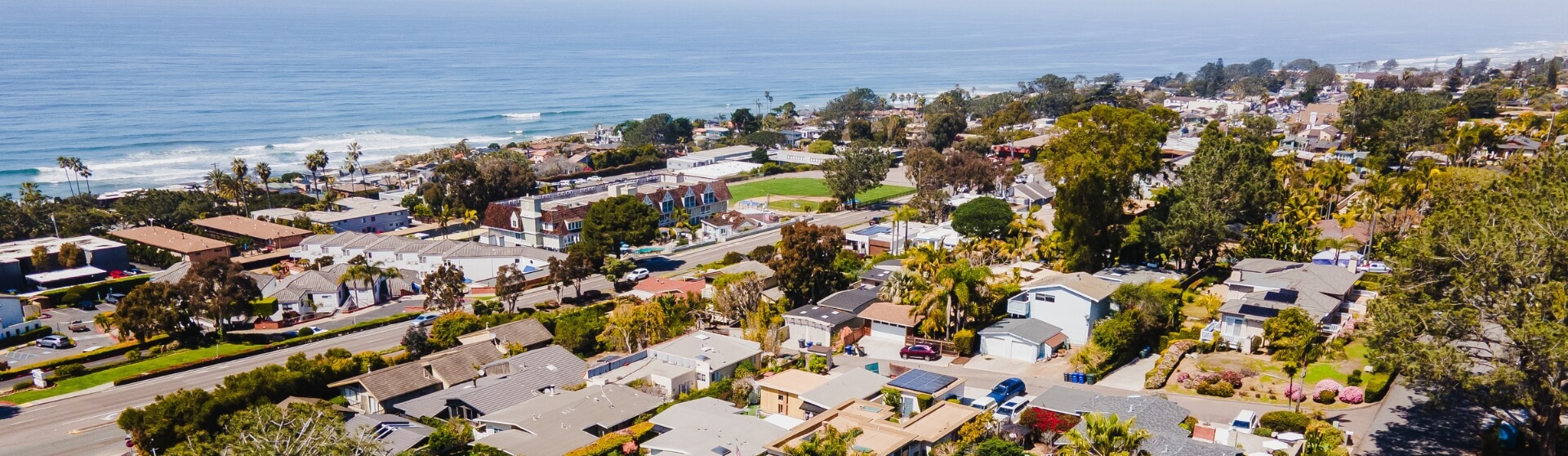
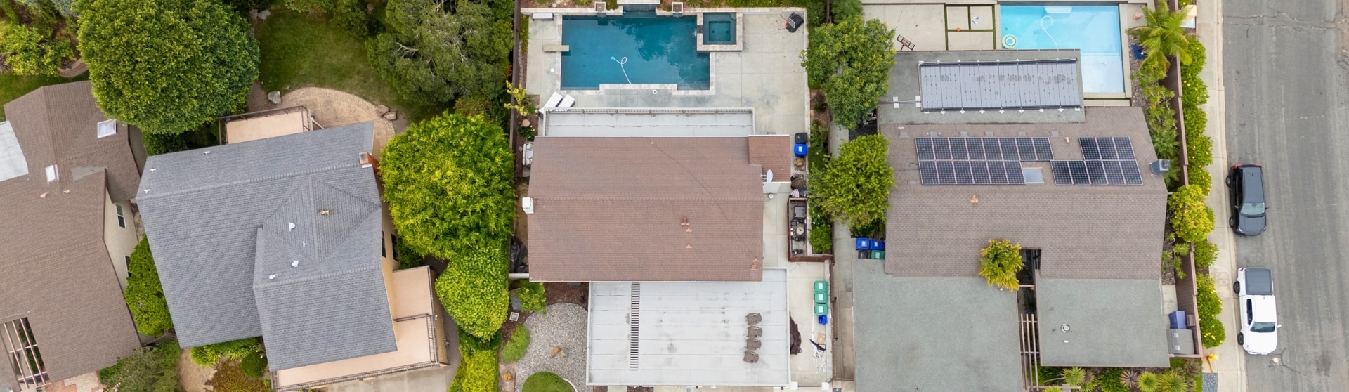
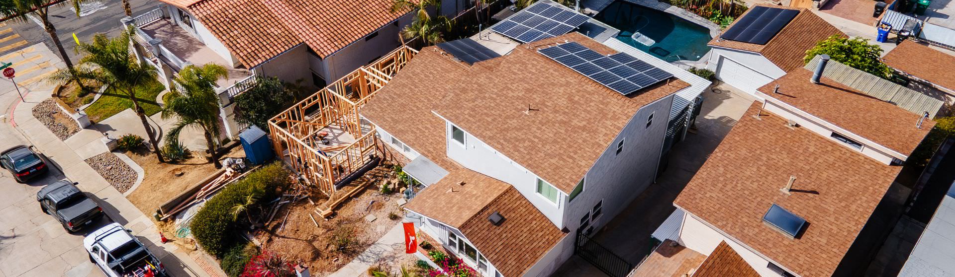
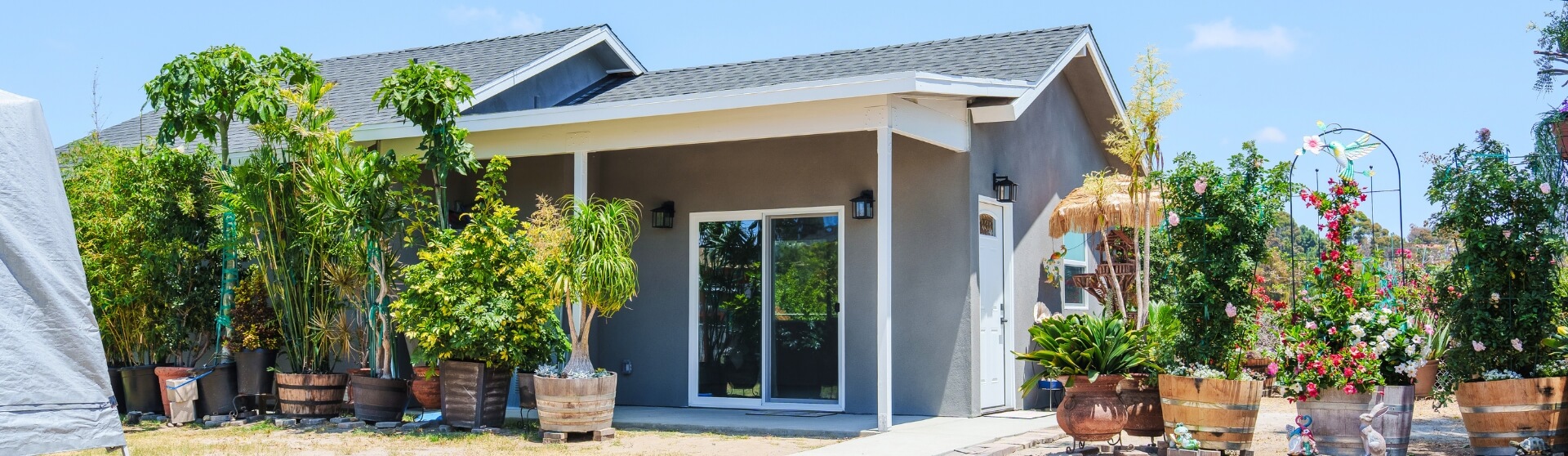
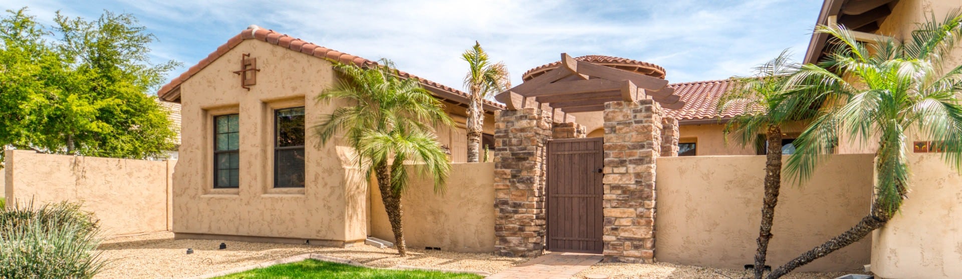
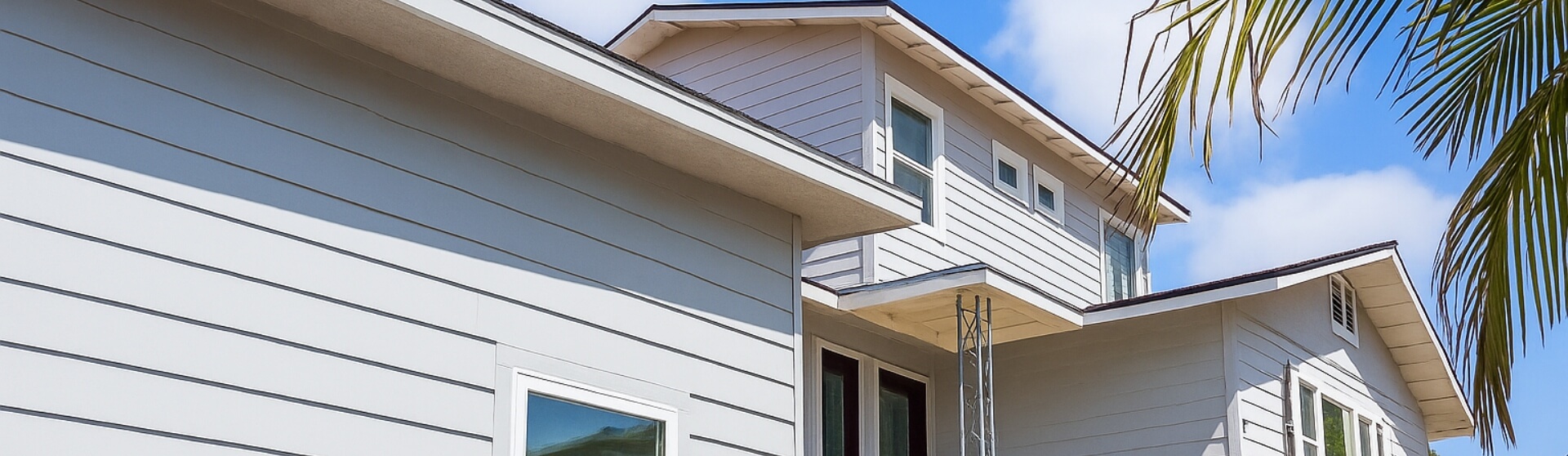
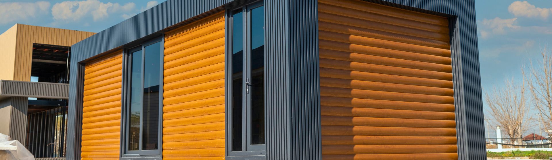
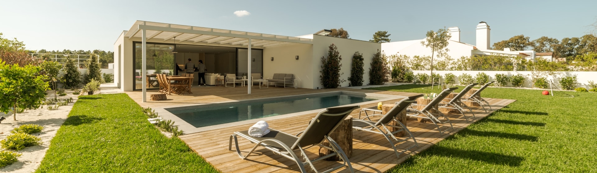
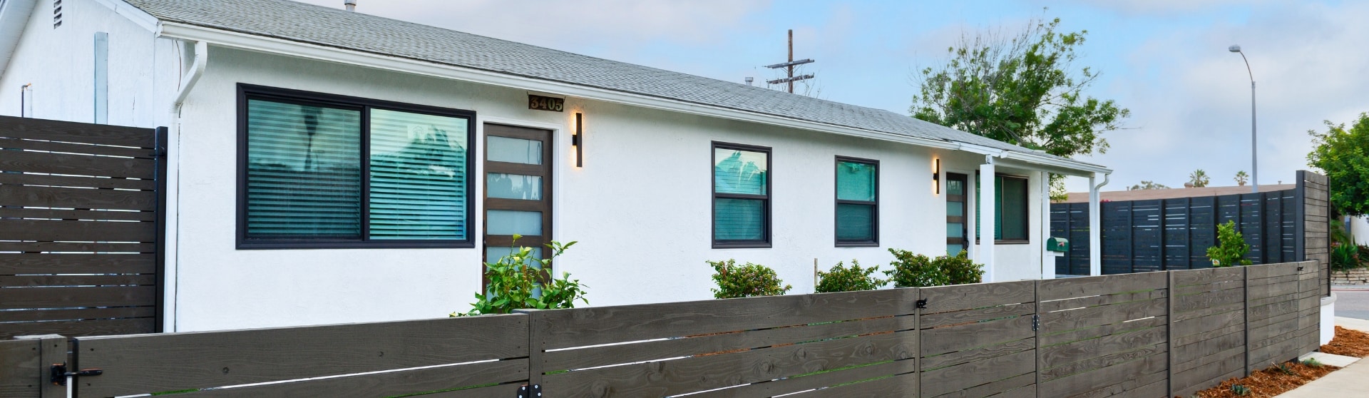
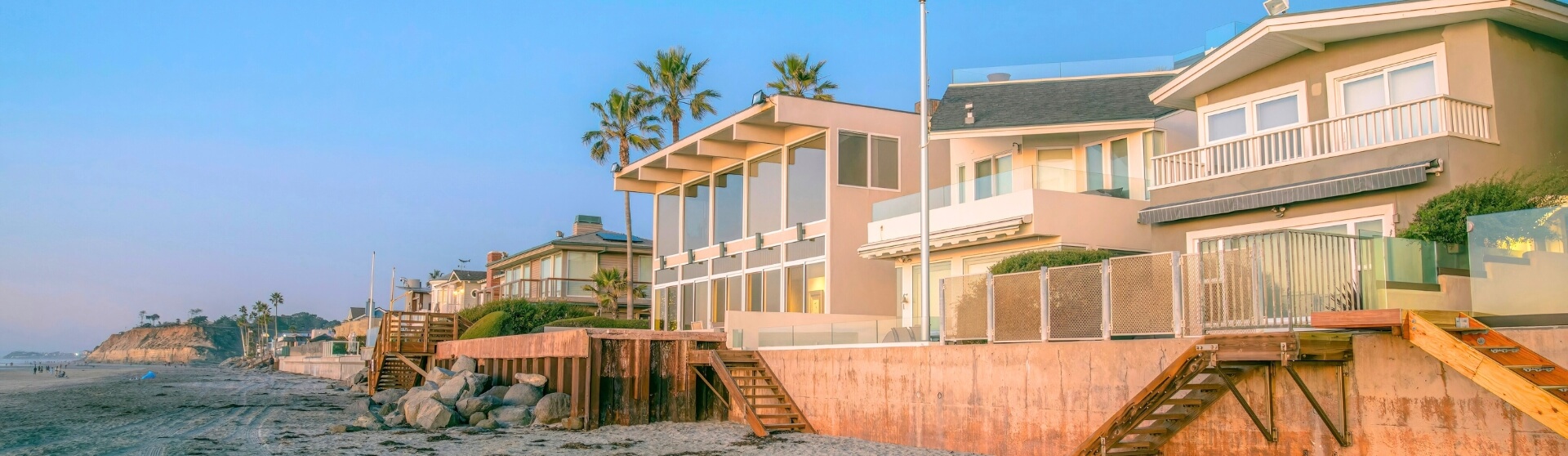
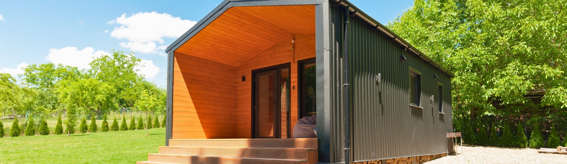
Exterior ADU Colors: Harmonizing with Your Property and Neighborhood
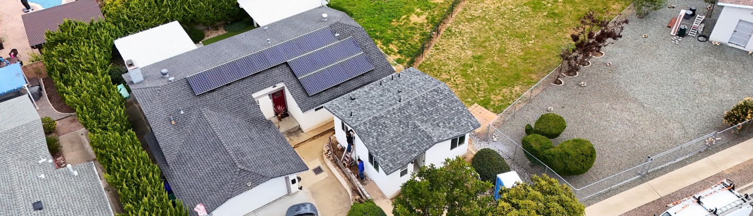
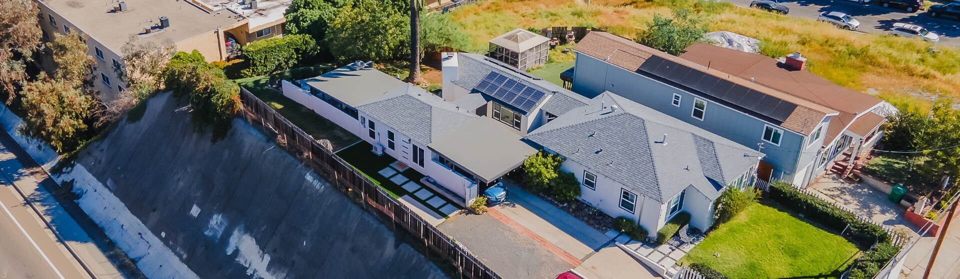
Choosing the right exterior colors for an ADU is essential for maintaining curb appeal, neighborhood harmony, and long-term comfort. In Greater San Diego, Craftsman-style ADUs often feature deeper body colors paired with contrasting trim, reinforcing architectural detail while still blending into established neighborhoods. Blending an ADU’s exterior palette with the primary residence—through compatible colors, materials, or trim—helps the structure feel intentional rather than visually disconnected.
From a climate perspective, lighter exterior colors reflect more sunlight and reduce heat retention, which is especially beneficial in Southern California and can help improve indoor comfort and energy efficiency (Bob Vila). Design data also shows a strong preference for neutrals, with white (23%), gray (19%), and beige (10%) ranking as the most popular exterior colors among homeowners, reflecting their versatility and broad appeal (Architectural Digest). Softer tones like gray and navy continue to trend because they add depth without overpowering the home, while earthy, natural hues align with growing sustainability and climate-conscious design preferences.
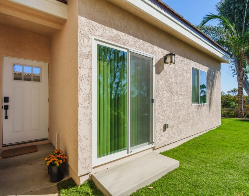
Exterior color harmony strengthens curb appeal and compliance, helping ADUs feel like intentional extensions of the main home rather than visual afterthoughts.
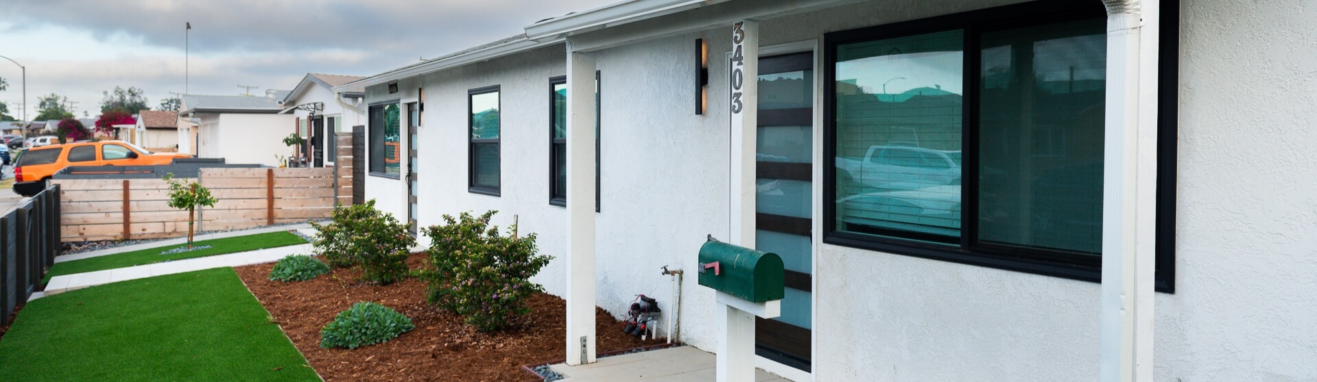
Blending In: Matching Your ADU to the Main Residence
Matching an ADU to the main residence is often both a design best practice and a regulatory requirement, as many local jurisdictions and HOAs require exterior compatibility to preserve neighborhood character. Aligning architectural details—such as rooflines, trim colors, window styles, and siding materials—helps the ADU feel like a natural extension of the property rather than a standalone add-on.
Stick-built ADUs typically offer greater flexibility for matching finishes and proportions compared to prefab or modular units, which may have more standardized exterior options. Thoughtful landscaping also plays a critical role, as shared plant palettes, hardscaping materials, and sightlines can visually tie the ADU and primary home together, reinforcing cohesion even when the structures are physically separate.
Standing Out (Tastefully): Creating Intentional Contrast
Creating intentional contrast allows an ADU to have its own identity while still feeling cohesive with the property. Contrasting trim and window frames—often black or crisp white—are commonly used in modern and industrial-inspired ADUs to add definition and highlight architectural lines. Bohemian-style ADUs introduce contrast through earthy accent tones like terracotta, mustard, and teal, layered over neutral bases to create warmth and visual interest without overwhelming small spaces. Scandinavian design achieves contrast more subtly by pairing light neutrals with natural wood tones, maintaining brightness while adding depth and texture. Across all styles, limiting bold accents and anchoring them with neutral foundations helps maintain balance and broad appeal in compact ADU layouts.
The Role of Natural Light and Environment on Exterior Colors
Natural light plays a major role in how exterior ADU colors are perceived, as lighter paint colors reflect sunlight and appear brighter and more expansive throughout the day, especially in sun-rich regions like Southern California. Large windows, sliding glass doors, and indoor-outdoor openings increase light exposure, which can intensify lighter palettes and soften darker accents, helping the ADU feel more open and connected to its surroundings. Window placement also directly affects color perception—north-facing walls may appear cooler and more muted, while south- and west-facing elevations amplify warmth and brightness. Recessed windows and architectural shadows add depth and contrast to exterior surfaces, allowing neutral or light colors to feel more dynamic rather than flat while maintaining broad curb appeal.
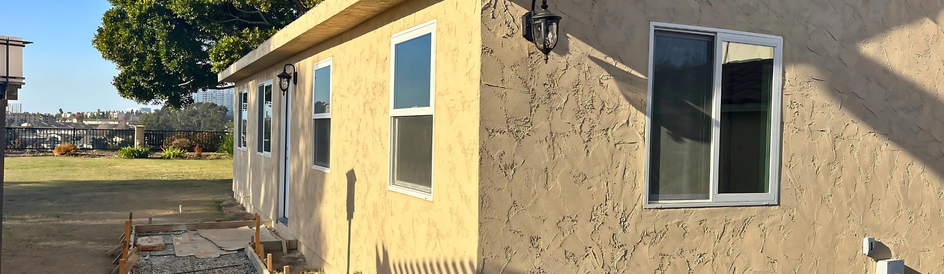
Practical Considerations for Exterior Paint
Exterior paint color strongly shapes first impressions and can influence both perceived quality and rental appeal, making neutral palettes a common choice for ADUs due to their broad, renter-friendly appeal. In warm climates like California, lighter exterior colors help reduce heat absorption, which can improve interior comfort and lower cooling costs by minimizing heat retention. This effect can be amplified by using highly reflective coatings, which have been shown to reduce exterior surface temperatures by up to 50°F compared to darker surfaces. In coastal or sun-exposed environments, investing in high-quality exterior paint is essential, as UV exposure, salt air, and moisture can accelerate fading and wear, making durability just as important as color choice.
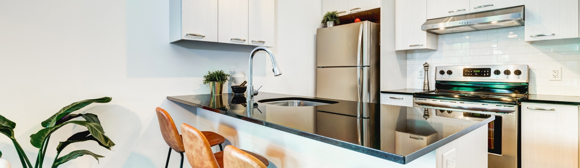
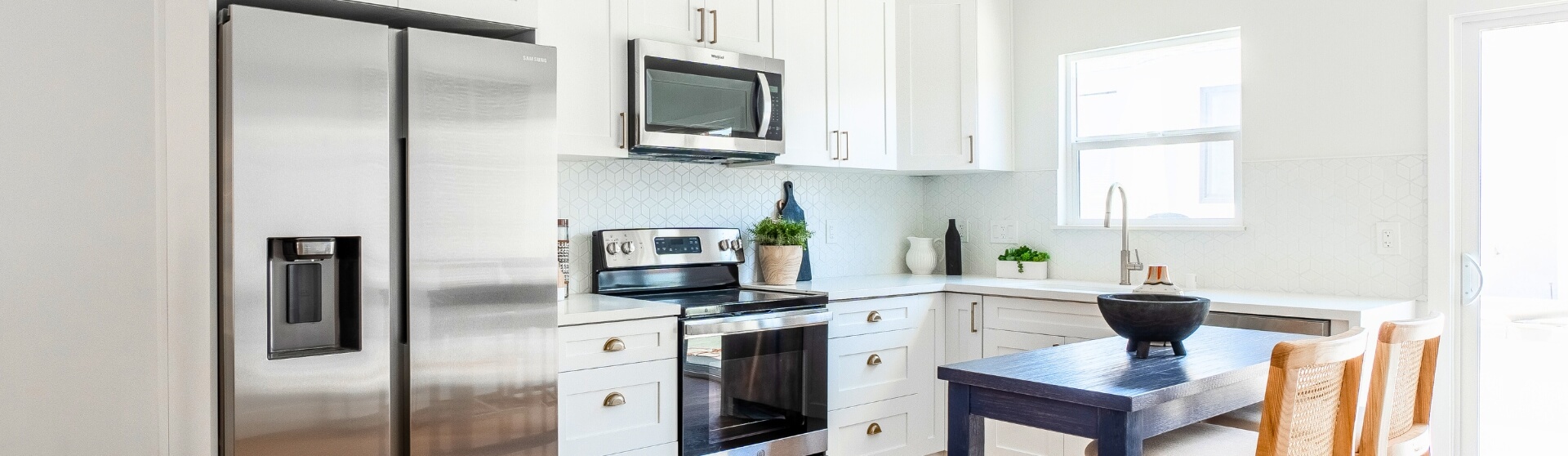
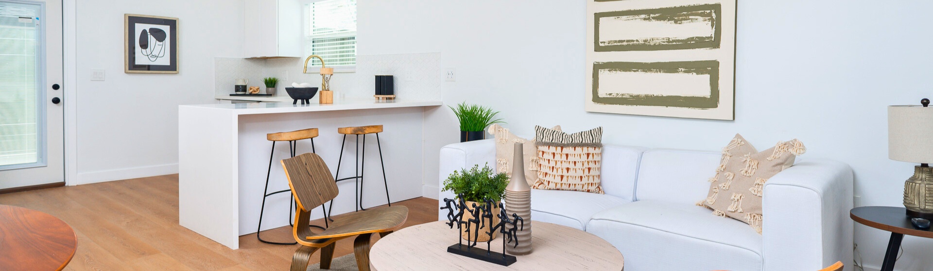
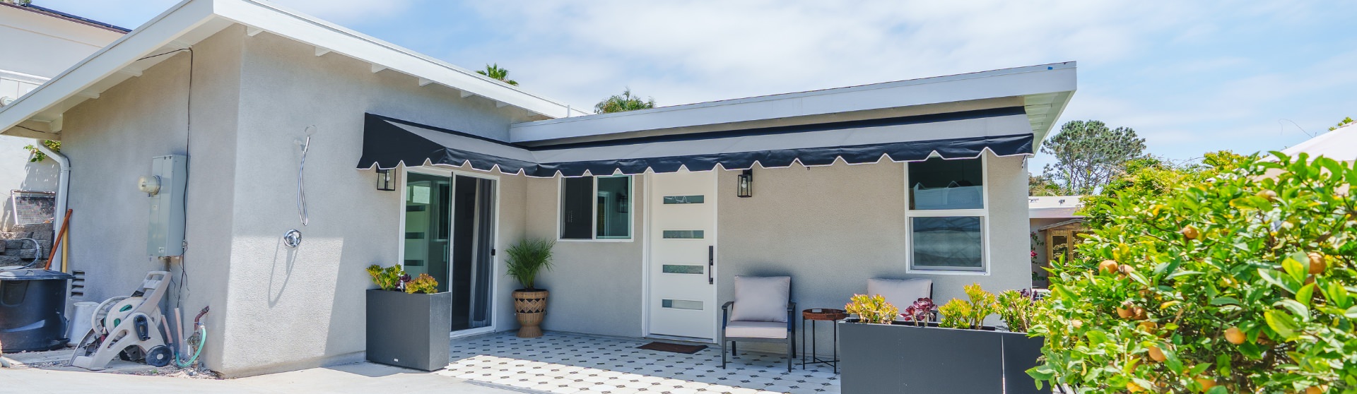
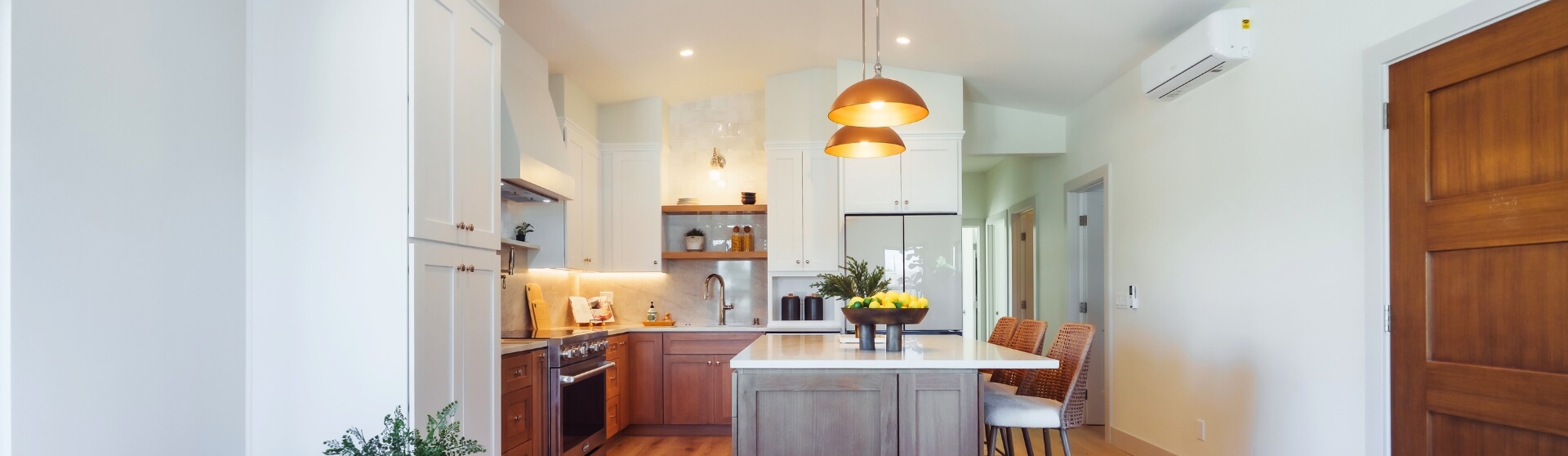
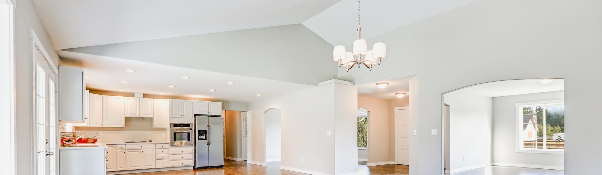
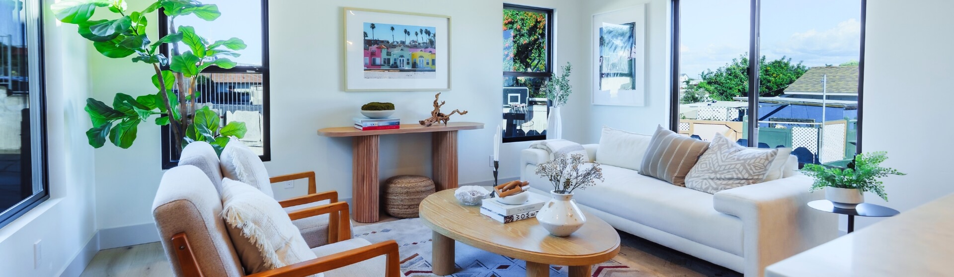
Interior ADU Colors: Maximizing Space, Light, and Livability
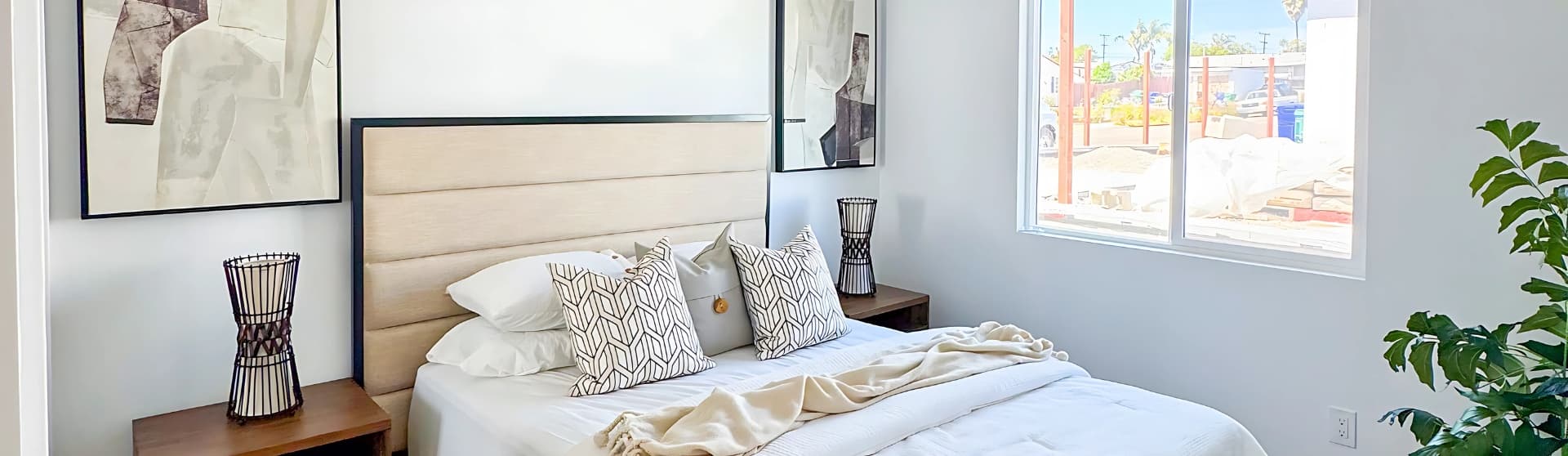
Interior color choices play a critical role in how spacious and comfortable an ADU feels, especially given its compact footprint. Light neutral colors—such as whites, soft grays, and pale neutrals—reflect more natural light and visually expand small interiors, helping ADUs feel open rather than confined. Designers frequently layer in soft gray or navy blue to add depth and sophistication without overwhelming the space, a strategy that maintains broad appeal for renters and guests. Maintaining a consistent color palette throughout the ADU improves visual flow, while neutral wood tones introduce warmth and balance, preventing light interiors from feeling sterile and supporting a calm, livable environment.
Light-reflective finishes and pale color palettes amplify natural light, a proven method for making compact ADU interiors feel more open and breathable.
Strategies for Making Small Spaces Feel Larger and Brighter
Making a small ADU feel larger starts with maximizing both natural and artificial light, as brighter spaces are consistently perceived as more open and breathable. Light wall colors paired with ample daylight reflect illumination throughout the unit, a principle interior designers use to visually expand compact interiors. Incorporating reflective materials—such as mirrors, glass, and glossy or satin paint finishes—further amplifies available light, enhancing depth without adding square footage. Finally, using vertical storage and wall-mounted or floating furniture preserves floor space, reducing visual clutter and reinforcing a sense of openness that is essential in small ADU layouts.
The Power of Accent Walls and Strategic Color Pops
Accent walls are an effective way to introduce personality into an ADU without overwhelming a small space or increasing costs, as changing a single wall can create a clear focal point while keeping the overall palette calm and cohesive. To ensure balance, designers commonly rely on the 60-30-10 rule, which recommends using 60% of a dominant color, 30% of a secondary color, and 10% as an accent to maintain visual harmony in compact interiors. When used strategically, accent colors—such as a navy feature wall or a muted green backsplash—add depth and interest while preserving the openness that ADUs require.
Color Palettes for Popular ADU Architectural Styles
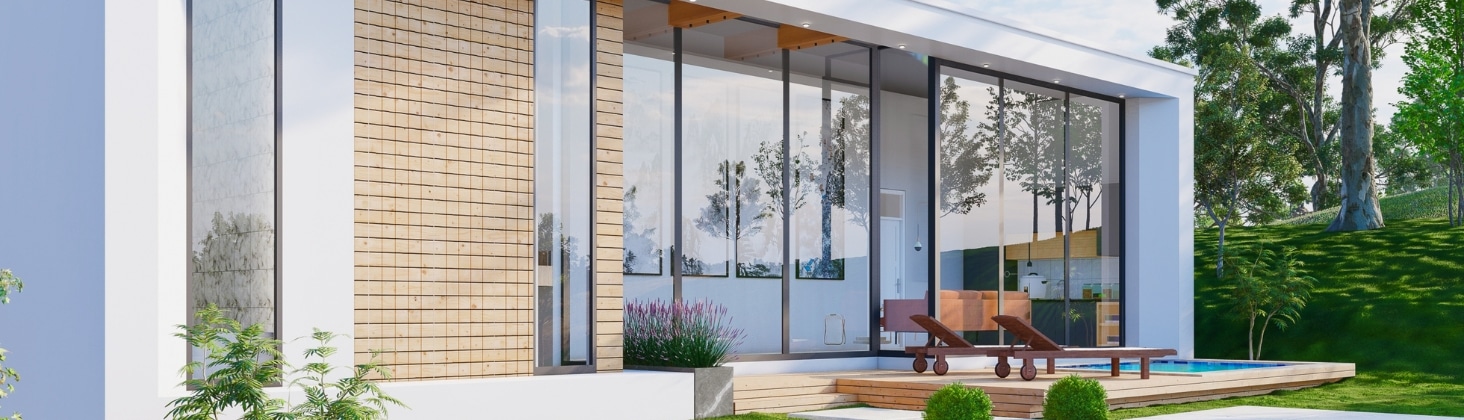
Modern ADU Colors
Modern ADUs typically rely on light neutrals such as white, soft gray, and beige, layered with subtle contrast to emphasize clean lines and open layouts. Designers often incorporate natural wood tones and restrained accent colors to add warmth without disrupting the minimalist aesthetic, creating interiors that feel calm, spacious, and contemporary. This approach keeps the space visually uncluttered while remaining highly appealing to renters and long-term occupants.
Modern ADUs benefit from restrained color contrast—neutral bases with subtle depth keep interiors visually clean while supporting strong rental and resale appeal.
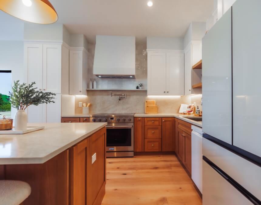
Farmhouse ADU Colors
Farmhouse-style ADUs favor warm, neutral bases—often white or light cream—paired with contrasting accents like black trim or muted earth tones to create a cozy, lived-in feel. Natural materials such as wood beams, shiplap, and stone are commonly highlighted through color contrast, reinforcing the rustic charm while maintaining visual balance in a smaller footprint.
Craftsman ADU Colors
Craftsman ADUs are known for earthy color palettes, including warm browns, deep greens, and muted blues, often paired with lighter trim for contrast. These tones complement the use of natural materials and detailed architectural elements, helping the ADU feel grounded and intentional rather than visually busy. In Southern California, this style is especially popular for blending ADUs into established neighborhoods.
Coastal ADU Colors
Coastal ADU color schemes emphasize whites, sandy beiges, and soft blues or greens to reflect light and create a relaxed, airy atmosphere. This palette is particularly well-suited to San Diego and other coastal areas, where lighter colors enhance natural brightness and mirror the surrounding environment. The result is a serene, open feel that maximizes both interior comfort and curb appeal.
Coastal-inspired palettes leverage soft blues and light neutrals to reflect daylight, a proven technique for making small ADUs feel fresh and expansive.
Scandinavian ADU Colors
Scandinavian-style ADUs rely on white, light gray, and pale neutral tones, combined with natural wood finishes to balance brightness and warmth. This palette is intentionally minimal, designed to reflect as much natural light as possible and make compact interiors feel larger and more functional. Consistency across surfaces is key to maintaining the clean, cohesive look this style is known for.
Spanish Revival ADU Colors
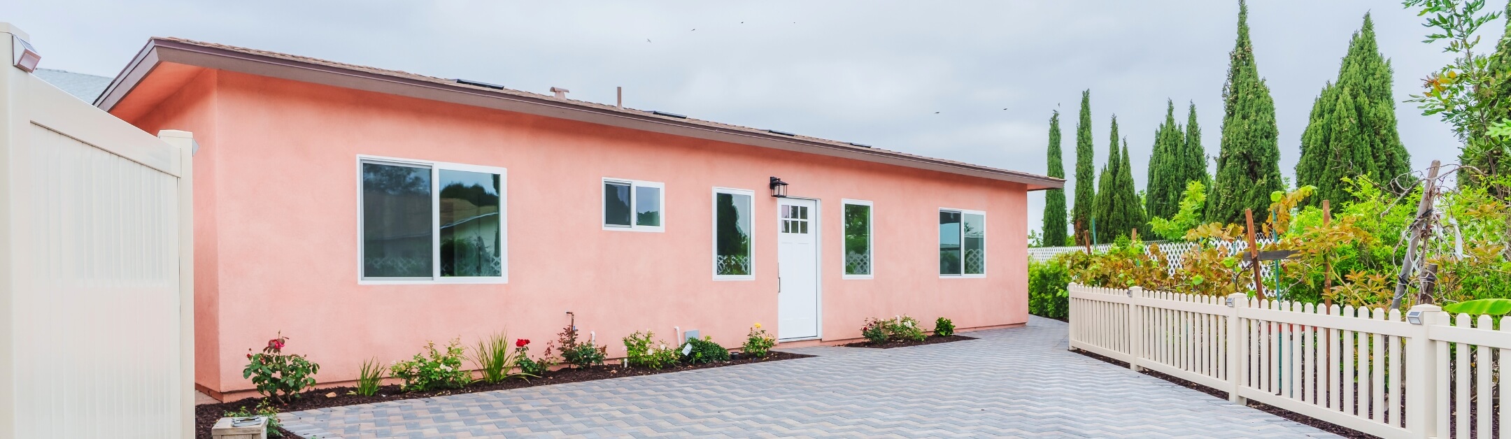
Spanish Revival ADUs commonly feature warm, earthy hues such as soft terracotta, cream, and muted beige, often applied to stucco finishes for texture and depth. These colors create a timeless, elegant appearance while still benefiting from lighter tones that help smaller ADUs feel more open. In Southern California, this style remains popular for its ability to blend tradition with modern livability.
Spanish Revival palettes rely on warm, earthy tones applied to textured finishes, creating depth and character while still using lighter hues to prevent small ADUs from feeling heavy.
Practical Considerations and Expert Tips for Choosing ADU Colors
When selecting colors for an ADU, experts recommend avoiding generic “landlord special” palettes that rely on flat, uninspired beige or gray, as these can make small spaces feel lifeless and forgettable. Instead, designers suggest starting with renter-friendly neutral foundations—such as white, soft gray, or light beige—and layering in subtle personality through texture, wood tones, or restrained accent colors. This approach maintains broad appeal while still allowing the ADU to feel intentional and well-designed, a balance that specialists note can increase both rental desirability and long-term value.
Conclusion: Creating Your Perfect ADU Color Story
A well-chosen color scheme plays a powerful role in shaping an ADU’s comfort, functionality, and long-term value, particularly in compact spaces where every design choice is amplified. Research and expert guidance consistently show that light, neutral foundations paired with intentional accent colors create interiors that feel larger, calmer, and more broadly appealing to renters and guests. Maintaining color consistency throughout the ADU enhances visual flow and cohesion, helping the space feel thoughtfully designed rather than fragmented.
A cohesive color story ties every space together, reinforcing flow and comfort while increasing long-term appeal for both renters and homeowners.
Frequently Asked Questions
The best colors for ADUs are light, neutral tones such as white, soft gray, beige, and pale pastels, because they reflect natural light and make small spaces feel larger and more open. ADU design experts note that swapping darker palettes for lighter ones can dramatically improve how spacious an ADU feels. Trending accent colors like navy blue or muted green add depth and character without overwhelming compact interiors.
The classic 60-30-10 rule assigns 60% of a space to a dominant color, 30% to a secondary color, and 10% to an accent. When incorporating a fourth color, it typically comes from the 10% accent portion, meaning the accent is split into two smaller accent shades rather than expanding the palette overall. This approach preserves visual balance and prevents small spaces—like ADUs—from feeling cluttered or chaotic.
Renters are most attracted to neutral, light-colored interiors that feel clean, bright, and flexible. Design authorities consistently report that whites, light grays, and warm neutrals appeal to the widest audience because they feel modern yet welcoming. Adding subtle personality through wood tones or restrained accents helps avoid a sterile “landlord special” look while maintaining broad rental appeal.
For ADU exteriors, light neutrals like white, gray, and beige perform best, both aesthetically and functionally. A Houzz study cited by Architectural Digest found that white (23%), gray (19%), and beige (10%) are the most popular exterior colors, often paired with contrasting trim for definition. In warm climates such as California, lighter colors are especially effective because they reflect heat and help reduce cooling costs.
Color choices directly influence how large, cohesive, and inviting an ADU appears. Light and cool tones visually recede, making small structures feel more spacious, while consistent color palettes improve flow and reduce visual fragmentation. On the exterior, coordinated colors that either complement or intentionally contrast with the main home enhance curb appeal and help the ADU feel like a purposeful extension of the property rather than an afterthought.
More Projects
-
ADU Trends & Insights
How Long Until an ADU Pays for Itself?
Most ADUs pay for themselves within 5–15 years by combining rental income and property value appreciation, with faster payback in high-demand markets like San Diego.
-
ADU Trends & Insights
The Perfect ADU Kitchen
Discover how smart layouts and stylish design choices can transform even the smallest ADU kitchens into luxurious, functional spaces.
-
ADU Trends & Insights
Downsizing to an ADU: Benefits, Costs, and Key Considerations
Downsizing to an ADU means moving into an Accessory Dwelling Unit—a smaller, self-contained home on your property—while renting out or repurposing your main house.
-
ADU Trends & Insights
What Are ADU Electrical Requirements in California?
Get the complete breakdown of electrical requirements for ADUs in California, from panel upgrades to solar compliance, to help you build safely and within code.
-
ADU Trends & Insights
Can You Sell an ADU in San Diego?
San Diego's pending ordinance may soon enable homeowners to sell ADUs as separate condominiums, expanding affordable housing opportunities.
-
ADU Trends & Insights
Best ADU Designs
Explore essential ADU design trends and practical insights, from layout optimization to style choices, ensuring your accessory dwelling unit maximizes comfort, functionality, and investment potential.
-
ADU Trends & Insights
How We Make Your ADU’s Interior Design Stress Free & Feel Like Home
Our interior designers simplify the finish selection process—so you get a stylish, renter-friendly ADU without the stress, delays, or costly mistakes.
-
ADU Trends & Insights
Why ADUs & Costs Matter in San Diego
Planning an ADU in San Diego? Get the lowdown on all the hidden costs that can catch you off guard.
-
ADU Trends & Insights
Custom ADU: Your Ultimate Guide
A custom ADU may cost more than manufactured or prefab units, depending on size, type, and finishes, but it offers several benefits.
-
ADU Trends & Insights
How Much Does an ADU Increase Property Value?
Discover how adding an ADU can significantly boost your property value, generate rental income, and enhance long-term equity—all while making the most of your available space.
-
ADU Trends & Insights
Do You Trust Your Builder?
You can trust your ADU builder when they prove real ADU experience, proper California licensing/insurance, and clear written contracts, not just a good sales pitch.
-
ADU Trends & Insights
What Is a Casita? Definition, Uses, and How It’s Different From an ADU
Casitas are stylish, small ADUs under 800 sq. ft., perfect for guests, rentals, or in-law suites. Discover the benefits, costs, and designs.
-
ADU Trends & Insights
What Makes an Ideal Lot for an ADU in California (Especially San Diego)?
An ideal ADU lot in California (especially San Diego) is flat or gently sloped with enough clear buildable space for setbacks, good construction access, nearby utility tie-ins, and minimal easements or overlays—since slope, access, and utility distance are the biggest drivers of cost and feasibility even with “by-right” ADU rules.
-
ADU Trends & Insights
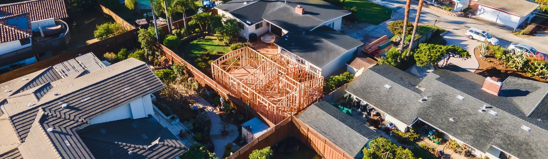
What Is ADU Construction?
ADU construction involves planning, permitting, and building a self-contained living space on a residential property — adding value, flexibility, and income potential without buying new land.
-
ADU Trends & Insights
What Is a Retaining Wall for an ADU?
A retaining wall for an ADU is a structural wall designed to hold back soil, stabilize slopes, and create a level building area. These walls help prevent erosion, protect the structure from water damage, and make construction possible on sloped or uneven lots.
-
ADU Trends & Insights
How to Finance an ADU in San Diego
ADUs are growing popular in San Diego, offering housing for family or rental income, but demand substantial upfront investment.
-
ADU Trends & Insights
ADU vs JADU: What’s the Difference?
Explore the crucial differences between ADUs and JADUs—including size, regulations, costs, and ROI—to determine the best fit for your property and goals.
-
ADU Trends & Insights
When Should You Build an ADU in San Diego?
ADU construction involves planning, permitting, and building a self-contained living space on a residential property — adding value, flexibility, and income potential without buying new land. In California, ADUs now make up about one in six new homes, reflecting their growing role in solving the state’s housing shortage.
-
ADU Trends & Insights
Garage ADU: What It Is, Costs, Rules, and Conversion Options
Unlock your property's potential by converting your detached garage into a cost-effective, versatile ADU that increases property value and generates rental income.
-
ADU Trends & Insights
What Are the Best Loan Programs for ADUs in California (San Diego Guide)?
California homeowners can finance ADUs through home equity, construction or renovation loans, cash-out refinancing, and programs like CalHFA (when available) and San Diego’s SDHC, with the best option depending on equity, income, and timing.
-
ADU Trends & Insights
Is it Worth It To Build An ADU in 2026? Assessing the ROI of Building an ADU
Discover the financial benefits and pitfalls of building an ADU with our comprehensive, detailed guide.
-
ADU Trends & Insights
Using a HELOC to Fund an ADU in California?
A HELOC lets California homeowners fund an ADU in phases using home equity, paying interest only on what they use. In San Diego, strong rental income often offsets payments, though variable rates and post–draw-period repayment increases should be considered.
-
ADU Trends & Insights
Spanish Style ADUs
Explore the timeless elegance of Spanish-style ADUs with iconic features like stucco walls, red tile roofs, and stunning architectural details.
-
ADU Trends & Insights
SB9 vs ADU: What’s the Difference and Which Is Better?
While promising, the complexity and lengthy approval process of SB9 projects make traditional accessory dwelling units (ADUs) an often simpler and quicker alternative for expanding property use.
-
ADU Trends & Insights
Where Can ADUs be Built in San Diego, CA?
ADUs are allowed on nearly all residential lots in California, including single-family and multifamily properties, under state law. In San Diego, any property zoned for residential use qualifies, making it easier than ever for homeowners to add an ADU and expand their living or rental space.
-
ADU Trends & Insights
Setback Requirements for ADUs in San Diego
Ensure your ADU meets California's setback requirements—learn essential rules, local variations, and expert tips to maximize your space and streamline permitting.
-
ADU Trends & Insights
How Do You Budget for an ADU Build in California and San Diego?
Learn how to budget for an ADU in California and San Diego by understanding costs, timelines, financing options, and strategies to avoid surprises and maximize long-term value.
-
ADU Trends & Insights
What Roofing Options Are Best for ADUs in California (Especially San Diego)?
The best ADU roofing in California (especially San Diego) balances budget, durability, and curb appeal—using options like asphalt shingles, metal, tile, or low-slope membranes that meet Title 24 cool-roof/solar requirements and hold up to intense sun, heat, and wildfire risk.
-

ADU Trends & Insights
Construction Loans vs. Personal Loans for ADUs: What Do California Homeowners Need to Know?
Building an ADU in California typically requires high financing and San Diego homeowners usually choose between construction loans, which are based on the future value of the property, and personal loans, which offer fast approval but higher interest rates.
-
ADU Trends & Insights
What Is a Granny Flat? Definition, Types, and How They’re Used
Granny flats offer San Diego homeowners flexible housing solutions, from accommodating family to generating rental income, with options including detached builds, garage conversions, or junior ADUs.
-
ADU Trends & Insights
What are the universal design principles for ADUs?
Universal design principles for ADUs focus on creating safe, flexible, and comfortable homes—using features like step-free entries, wider doorways, accessible bathrooms, and intuitive layouts—so the space remains usable for people of all ages and abilities over time.
-
ADU Trends & Insights
How to Finance an ADU Project in California
California homeowners can finance an ADU using home equity, cash-out refinancing, construction or renovation loans, and programs like San Diego’s SDHC (up to $250K), with rental income often helping offset the $200K–$450K build cost.
-
ADU Trends & Insights
Should You Build Your ADU Yourself or Hire a Contractor in San Diego, California?
Building your own ADU in San Diego can save on labor and contractor markup, but it’s essentially managing a small-house build with permits, trades, and inspections—so hiring an experienced contractor (or using a hybrid approach) often reduces delays, risk, and costly mistakes.
-
ADU Trends & Insights
13 Common Misconceptions About ADUs
Uncover the truth about ADU misconceptions and navigate construction, costs, and regulations for informed decisions.
-
ADU Trends & Insights
How Do You Integrate Outdoor Living Into ADU Design?
Integrating outdoor living features such as patios, decks, and seamless indoor-outdoor connections helps ADUs feel larger, more livable, and more valuable.
-

ADU Trends & Insights
What Are the Best Floor Plans for ADUs?
The best ADU floor plans are goal-driven and code-compliant—using efficient layouts like studios, 1-bed/1-bath rentals, or split-bedroom designs that maximize light, privacy, and flexibility while fitting your lot and budget.
-
ADU Trends & Insights
What Are the Key Differences Between Attached and Detached ADUs in California?
An attached ADU shares at least one wall or structural connection with the primary residence, while a detached ADU is a standalone structure located on the same property. Both provide complete independent living facilities, including areas for living, sleeping, cooking, and sanitation, but they differ in privacy, construction requirements, utility infrastructure, design flexibility, and rental […]
-
ADU Trends & Insights
What Are Vaulted Ceilings and High Ceilings in ADUs and Are They Worth It in California?
Vaulted ceilings enhance ADUs by maximizing vertical space, increasing natural light, improving comfort, and boosting long-term property value in California when designed and built correctly.
-
ADU Trends & Insights
When Do You Need a Survey for an ADU in San Diego?
A survey for an ADU in San Diego is typically required when the new unit is built close to property lines, situated on a sloped or irregular lot, or when local regulations mandate setback verification.
-

ADU Trends & Insights
What Is an ADU Cost Calculator and How Much Does It Cost to Build an ADU in California?
An ADU cost calculator helps California homeowners estimate the cost of building an accessory dwelling unit based on factors like square footage, construction type, utility work, site conditions, and finish quality. In California, ADU construction costs typically range from $100,000 to $200,000, although detached ADUs with premium finishes or difficult site conditions can exceed that […]
-
ADU Trends & Insights
What Are the Legal Bedroom Requirements in California?
California has made building ADUs easier to tackle the housing crisis, but specific state and local regulations still apply. Here's what you need to know before starting.
-
ADU Trends & Insights
Are ADUs a good alternative to nursing homes for California homeowners?
ADUs offer California homeowners a practical alternative to nursing homes by allowing aging parents to live independently on the same property, supporting aging in place while turning ongoing care costs into a long-term home investment.
-
ADU Trends & Insights
Prefab ADUs: Pros and Cons
Explore the pros and cons of prefab ADUs in California, including cost, customization, durability, and ROI, to decide if modular construction suits your needs.
-
ADU Trends & Insights
What Qualifies as an ADU?
ADUs are reshaping the California housing market, providing homeowners with cost-effective, independent living spaces to meet diverse needs.
-

ADU Trends & Insights
What is the importance of an ADU feasibility study in California and San Diego?
An ADU feasibility study is a comprehensive analysis of zoning, site constraints, existing utilities, and a proposed design that determines whether building an accessory dwelling unit is practical and financially viable on a specific property.
-
ADU Trends & Insights
How do ADUs benefit real estate agents in California and San Diego?
ADUs benefit real estate agents in California and San Diego by increasing property value and buyer appeal, creating built-in rental and multigenerational living opportunities, and giving ADU-savvy agents a competitive edge in pricing, marketing, and closing deals in a tight housing market.
-
ADU Trends & Insights
What Is an ADU Cost Breakdown?
An ADU cost breakdown shows where your budget goes—hard construction costs (about 85–90%) versus soft costs like plans, permits, and city fees (about 10–15%)—so you can set realistic expectations and avoid surprises.
-
ADU Trends & Insights
What Are Stacked Accessory Dwelling Units (ADUs)?
Stacked ADUs are two fully independent accessory dwelling units built vertically in a single two-story structure, allowing California homeowners to add multiple homes on one lot without increasing the building footprint when local height and zoning rules allow.
-
ADU Trends & Insights
What Are ADU Owner Occupancy Requirements?
ADU owner occupancy requirements are rules that require a property owner to live on the same lot as an accessory dwelling unit, either in the primary residence or the ADU itself. These rules were historically imposed by local governments to discourage absentee landlords and preserve neighborhood character. In California, however, owner-occupancy requirements for ADUs are […]
-
ADU Trends & Insights
Key Differences Between Pool Houses and ADUs
Discover the differences between pool houses and ADUs to choose the right addition for your property—find out about amenities, regulations, and value impact!
-
ADU Trends & Insights
What Is ADU Project Management?
ADU project management is the process of overseeing every stage of an accessory dwelling unit project to ensure it stays on schedule, within budget, and compliant with local regulations. It involves coordinating architects, contractors, and inspectors while managing permits, timelines, and construction milestones. Effective project management also includes tracking costs, minimizing delays, and maintaining clear […]
-
ADU Trends & Insights
20 Day Preliminary Notice for ADUs in California: Requirements and Deadlines
A California 20-Day Preliminary Notice is a required filing for most ADU projects that subcontractors and suppliers must send within 20 days of providing labor or materials, notifying owners, contractors, and lenders.
-
ADU Trends & Insights
What Is ADU Rental Income and Why Are California Homeowners Investing in It?
Explore how to maximize rental income from an ADU with tips on design, rental strategies, and legal considerations to turn your ADU into a profitable investment.
-
ADU Trends & Insights
What Are the ADU Electrical Requirements in California in 2026?
California ADUs must comply with strict electrical and energy regulations under the California Electrical Code (CEC) and Title 24 energy standards. Most ADUs require detailed planning for electrical panels, load calculations, dedicated circuits, solar readiness, and utility coordination to meet modern safety and efficiency requirements. Homeowners in San Diego and across California often underestimate the […]
-
ADU Trends & Insights
Why Do You Need an Experienced ADU Builder in California?
An experienced ADU builder helps homeowners navigate California’s complex permitting rules, zoning regulations, and construction requirements while avoiding costly mistakes and delays. Accessory Dwelling Units (ADUs) are secondary housing units built on the same property as a primary residence and can include detached backyard homes, attached additions, garage conversions, or basement apartments with independent living […]
-
ADU Trends & Insights
How Do You Compare ADU Builder Quotes in San Diego and California?
Compare itemized ADU quotes—labor, materials, permits, timelines—to ensure transparent pricing, true value, and no surprise costs.
-
ADU Trends & Insights
How Does ADU Construction Work in San Diego, CA?
San Diego’s ADU process is fast and flexible, with permits approved within 60 days and options for detached units up to 1,200 sq. ft. or garage conversions. Thanks to state laws and the city’s ADU Bonus Program, homeowners can build quickly, add value, and even earn extra units by including affordable housing.
-
ADU Trends & Insights
What is stormwater management for Accessory Dwelling Units (ADUs) in California?
Stormwater management for ADUs is the process of controlling and treating rainwater runoff generated by new backyard cottages or secondary homes.
-
ADU Trends & Insights
How Many ADUs Can You Have on Your Property in California?
Understand California's rules for ADUs and JADUs, including property limits, zoning laws, and strategies to maximize space, rental income, and property value.
-
ADU Trends & Insights
Should You Invest in Building an ADU in San Diego?
Building an ADU in San Diego can be a worthwhile investment for homeowners looking to generate rental income, increase property value, or create flexible living space for family members. An Accessory Dwelling Unit (ADU) is a secondary residential unit built on the same lot as a primary home, and demand for ADUs continues to grow […]
-
ADU Trends & Insights
How to Build an ADU in the San Diego Coastal Zone
Building an ADU in San Diego’s Coastal Zone requires checking if the property is in the Coastal Overlay Zone, which typically triggers a Coastal Development Permit or exemption.
-
ADU Trends & Insights
California ADU Law: The Ultimate Guide
California has streamlined ADU construction to address the housing crisis, but development standards still apply. Check local regulations before starting your project.
-
ADU Trends & Insights
Can an HOA Prevent an ADU in California?
If you’re part of a homeowners association and considering building an accessory dwelling unit on your property, it's key to consider any rules your HOA may have about ADUs.
-
ADU Trends & Insights
Are Pre-Approved ADU Plans Right for You in San Diego?
Compare pre-approved vs. custom plans and why the cheapest option isn't always best.
-

ADU Trends & Insights
What Is the Cost of Building an ADU in California?
The cost of building an ADU in California varies based on factors such as size, design, site conditions, utility work, and local fees. A statewide homeowner survey found that the median ADU construction cost is $150,000, or approximately $250 per square foot, providing a useful benchmark for homeowners planning an ADU. The California Department of […]
-
ADU Trends & Insights
ADU Manufactured Homes in San Diego: Are They Right for You?
Discover whether a manufactured home is the right choice by exploring costs, regulations, benefits, and potential drawbacks.
-
ADU Trends & Insights
How Do You Design the Perfect Granny Flat?
Designing the perfect granny flat starts with understanding local ADU regulations, defining the unit’s intended use, and planning a layout that maximizes comfort within a compact footprint. In California, granny flats—legally classified as Accessory Dwelling Units (ADUs)—must comply with state and local rules covering size, setbacks, and permitting. A successful design balances budget, livability, and […]